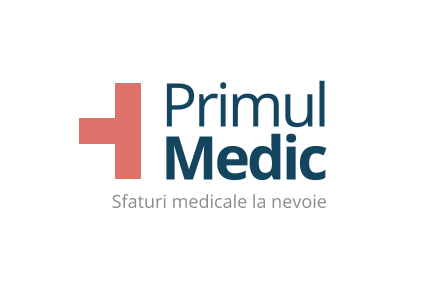
"Primul" means "First" in romanian language. Medic means... well, Medic. To design the logo, I cut half of a red cross in order to get a geometric "number 1" or "1st". I wanted to create a very basic element as close as possible to the universal "medical" symbol without breaking the Geneva Convention rules, because the "red cross" logo is highly protected.
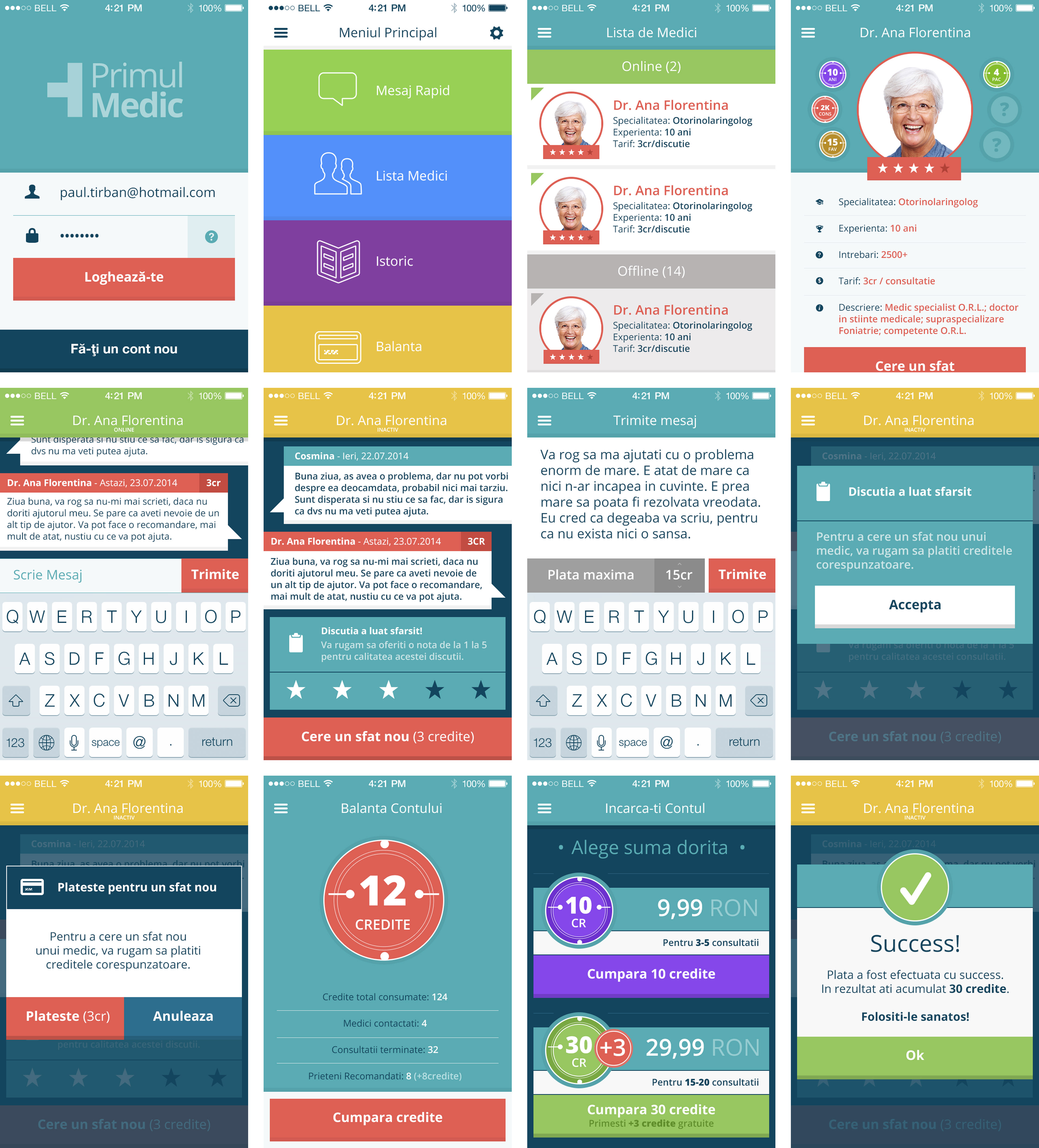
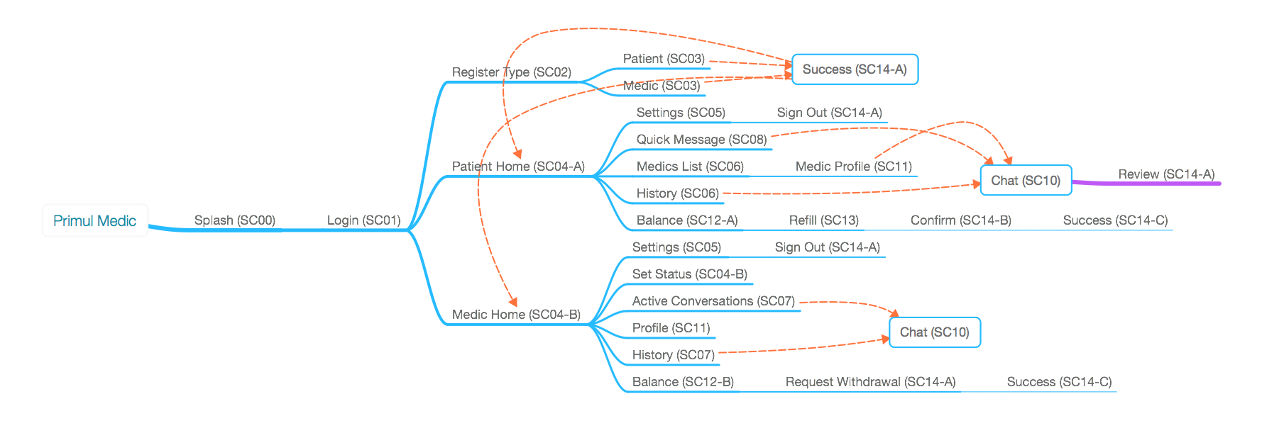
"Primul Medic" or "First Medic" is a very easy-to-use virtual platform for medical advice from real doctors, including therapists and physiotherapists. The patient announces their question, and the app automatically asigns them to a specific doctor, or to a generalist. They can start chatting with that doctor, or request a video call via Zoom. Although there's also a web platform, I was hired to create a mobile app, with the focus on chats.
This is the basic flow of the App.
And below is the User Interface of the App.
After making so many rounded cards and buttons for a living, I wanted to take a break and try a more square-leaning design direction, but with material design philosophy in mind. It was not only a fulfilling exercise but also created a stronger relationship with the logo's symbol. The client also liked it, which was a bonus. Although looking back now, I think it looks a little too visually rigid and constrained for a healthcare app that is supposed to create a safe space for patients. Nevertheless, it was a very cool project.